
WawWeed
WawWeed aims to solve the problem of finding the best deals for legalised cannabis in the USA for consumers and acting as a marketing platform for dispensaries to promote their deals.
A consumer app has been developed to allow the public to search specific brands, strains, and products in their area. Once the items have been added to the cart, the consumer can go to the relevant dispensary to pay and pick up the goods.
For the dispensaries, WawWeed has created a web portal where shop owners can upload their deals and manage all aspects of promoting their goods.
The Goal
How might we help cannabis dispensaries market their products and deals to consumers in the area? How can we best help the users find the best deals and specific strains they want in the simplest way?
In this case study, we aimed to overhaul the consumer app and dispensary web portal design to achieve the best user experience.
Research

I looked at various online chat groups about weed culture to find out what pain points and goals consumers were experiencing when purchasing cannabis.
Being consistent with terminology
This will help WawWeed content be simple to read and ease cognitive load. This will differ from most popular apps on the market right now.
Specifying the choices
Most consumers were looking for specific products/strains/brands or the best deal. Making the search features as efficient and intuitive as possible was the aim.
Initially I was part of the research group and we wanted to learn how competitors used features, what language was being used by consumers, and understand pain points experienced by both consumers and dispensary owners.
I conducted a feature inventory of various weed dispensary companies to see what services they offered and how they were presented to users.

Key Findings
Lack of organisation
The most common pain point stated in competitor app reviews was the complicated search functions when trying find to their specific brands/strains.
Content Style Guide
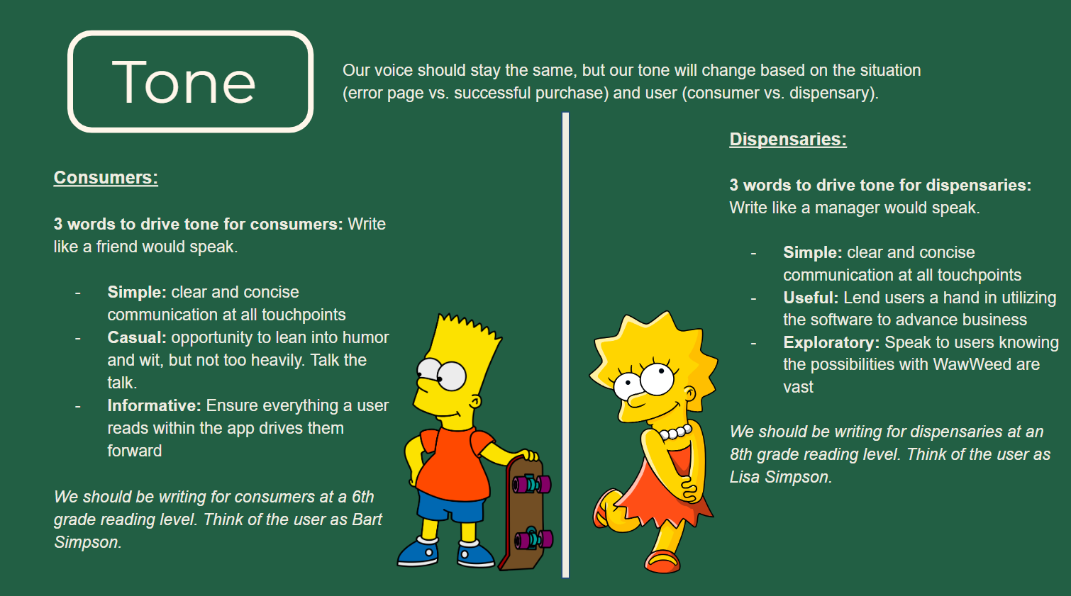
I was then tasked with writing the ‘grammar and mechanics’ section of the style guide as well as differentiating the tone for the consumer app and the dispensary platform.
Screen Revisions

‘Create Account’ screen
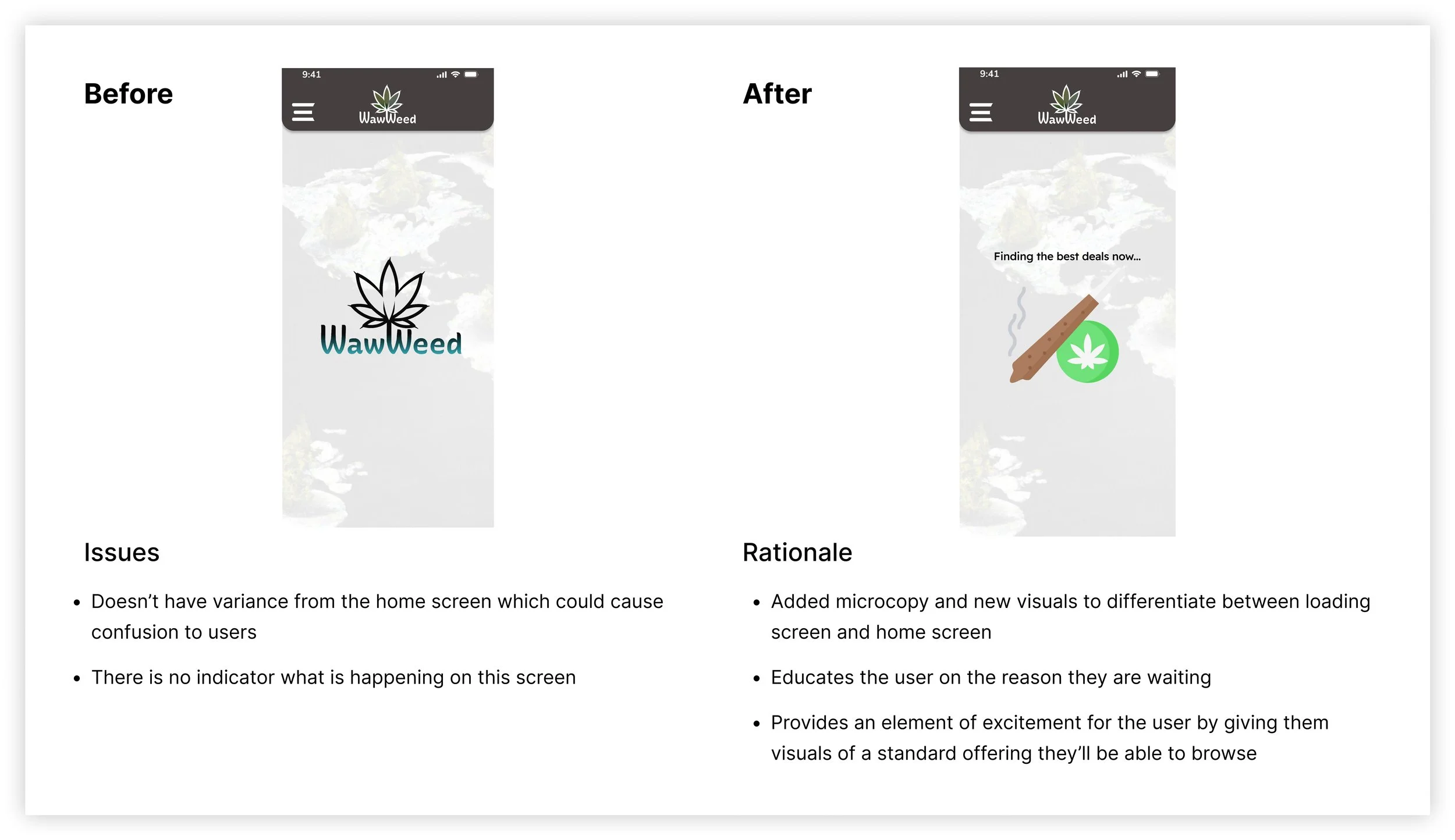
Loading Page
Key Findings
No limits to brainstorming
As this was a group exercise I was a little hesitant at first to put forward my more leftfield ideas.
The asynchronous format of working on the copy docs gave me more confidence to put the ideas forward and to my surprise, some were selected to be used in the final designs.
Finally, having created the content style guide, I reviewed and iterated the screens for various stages of the user journey to improve the experience and showcase WawWeed’s brand. Below are my contributions:
Giving personality to the user experience
The screens that had been designed were very generic and as there was no existing content style guide, the UX was quite disjointed.
This process showed me that it’s vital to have the research in place and to know what voice the brand has before designing anything.
Although the app has yet to be launched, both the developer and the CEO have taken some of our comments on board and implemented them into the product. As a student working for a real business, this gave me great confidence both in my work and the training I had received.
Final Thoughts
What I would have done differently
Working in a group offered different challenges than working solo. I found it helpful to bounce ideas around with colleagues and it was nice to hear positive comments regarding my edits. Working asynchronously on shared documents was sometimes challenging as there were often many comments to catch up with after any period away. However, it was educational to work with a mix of people from differing cultures and I thoroughly enjoyed having the opportunity to do so.